How to calculate and visualise the age of party candidates
Data is at the heart of telling the story of an election, and understanding how numbers of votes relates to the population of an area and seats won is important in order to communicate factually and correctly. But there’s other data points, too, which can be interesting and engaging for readers.
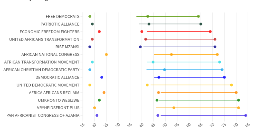
Take, for example, the age of candidates standing for election. It’s a diverting story to note that the average age of an ANC candidate is over 50 years old, some five years older than the average age of all candidates in the election and the eighth highest out of all parties contesting in 2024. But it also tells us something about where the party stands on bringing in newcomers: of the major parties, only Freedom Front Plus has an older cohort (average age is 52). The average age of a DA candidate is 47, the same as MK, while Rise Msanzi can proudly boast that it has the fourth youngest cohort with an average of 38. The “youngest” party is, fittingly, the South African Youth Power Party, with an average of 32.
This more than a bit of fun. A regular criticism of South African politics is that there are not enough younger people in government – so understanding the generational make-up of candidate lists can reveal much about its plans for succession.
So how can you calculate these ages?
Getting the data
First of all, we need to get the candidate lists from the IEC. The latest lists are available at this link.
There are three lists, one for the National vote, one for the Regional vote (which returns members to the National Assembly) and one for the provincial legislatures. We ran all three lists through Tabula to scrape the tables of names, which include the first few digits of an ID number – and therefore the date of birth.
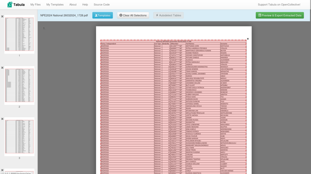
Tabula is a powerful and essential tool for working with data. You can learn how to use it here.
We then added the resulting CSV files to a Google Sheet, and created two new columns at the right of the table. The first column uses a formula to construct a date of birth from the ID number.
=concatenate(MID(B2,5,2),”/”,MID(B2,3,2),”/”,LEFT(B2,2))
“Concatenate” is a formula that tells Sheets to create a character string from multiple references or inputs. In this case, it’s the birth day, followed by the birth month, followed by the year.
To find the day, for example, we need to take two characters from the middle of the ID number. We use another formula to do this, called MID. To grab numbers five and six in the ID number, we use the formula MID(B2,5,2), for the month it’s MID(B2,3,2). To extract the year number it’s a slightly different formula. LEFT(B2,2) say to Sheets take two characters from the start of cell B2. Finally, each element of the date is separated by a forward slash (“/”), which must be surrounded by quote marks to show Sheets this is a text character and not a command to divide numbers.
Now we have a date of birth for each candidate, working out the age is easy, as Sheets has a formula just for this. It’s called =DATEDIF.
=DATEDIF(F2,Today(),”y”)
The “today()” and “y” arguments tell DATEDIF if to work out the number of years between the date in F2 (our new DOB column) and today.
Visualising candidate ages
Now we have the ages of all candidates in years, we can use Pivot Tables to calculate the youngest, eldest and average age of all candidates on the list, by party. There are almost 10 000 names across all three lists, and Pivot Tables are quick way of summarising large amounts of data.
You can create a Pivot Table by selecting any cell on our Sheet, and navigating to Insert>Pivot Table. You’ll see a blank tab is created, with a menu for adding datapoints on the left. In our case, we want the rows of data to contain party names, and then three values to be calculated for each party. You can see how we have set this up here:
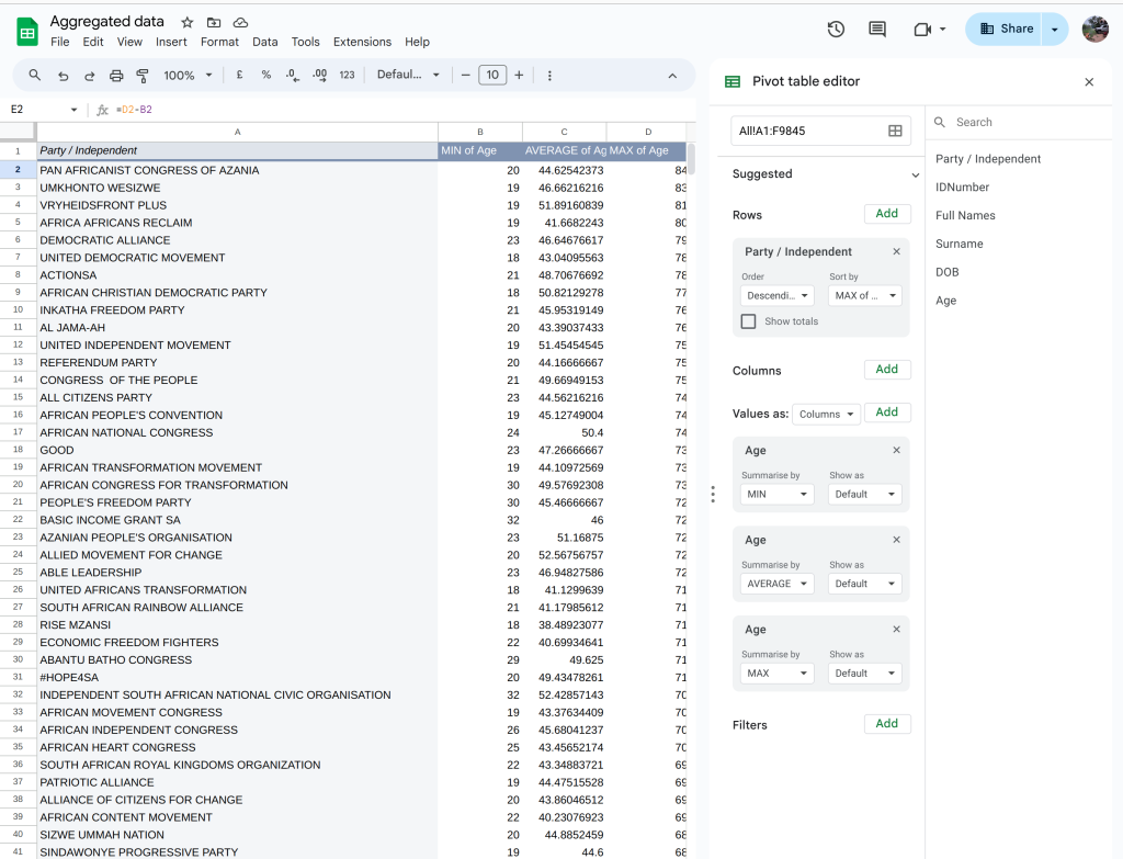
Note that under Values, we have added the column Age three times, but with a different method for summarising the numbers (Min, Max and Average).
We can also sort this chart, using the pull down menu in the Rows option that says “Order”. Sorting by Min of age>Ascending, for example, will put the parties with the youngest candidates at the top. Average of Age>Descending, meanwhile, will put the parties with the highest average ages at the top of the list.
Since there are so many parties contending the election, a visualisation which includes every party would be very large and hard to read. So we have opted to show just a selection which includes the parties with the youngest and eldest candidates, and the main political parties such as the ANC, DA, EFF, and so on. We have also included some of the more prominent new parties, like MK and Rise Mzansi.
To create the visualisation above, we used the excellent dataviz tool, Flourish. We won’t be walking you through all aspects of Flourish, but there is an excellent tutorial covering the basics here.
We chose to use a scatter plot with three points per party. By setting the box “Series (connect with line)” to the party name, we make it easier to see how candidates are distributed by age within the lists.
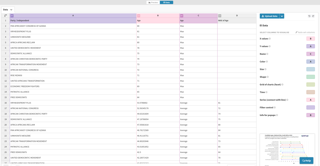
Giving each party its traditional colour requires a little bit of manual tweaking in the main configuration menu, found in the Preview mode for your chart.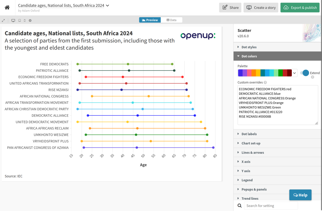
Finally, you can publish your chart as a static image or interactive using the button at the top right hand side. We went further and combined four similar charts in a Flourish Story to create the interactive above. We’ll explain how to do that in another tutorial.
