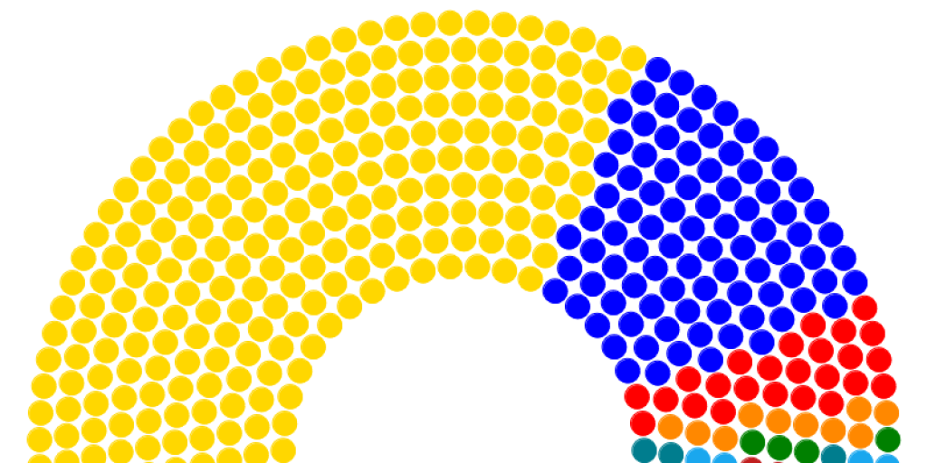
How to make a parliament chart in Flourish
Making election data available for readers means more than just putting numbers on a page. Visualisations can help to communicate information in a way that is both meaningful and quick to grasp. Choosing the right visualisation – such as a bar chart, map or pictogram – is key to getting your message across clearly, and there is a visual language that has grown up around elections that you can draw on using free and easy-to-use tools.
Take, for example, the Parliament Chart. This is used by journalists and illustrators all over the world to show the make-up of a legislative body. It allows readers to quickly grasp the size and relative influence of parties and elected representatives in an assembly. One dot indicates one member of parliament or assembly, while the colour represents the party. A semi-circle is used both to reflect the typical layout of an assembly building, and because it enables quick high level comparisons of party sizes.
Here’s a parliament chart showing the make-up of the National Assembly after the 2019 general election.
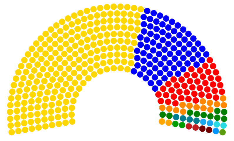
You can tell instantly that the large yellow party – the ANC – has more than half of the seats and therefore a majority, but only just. It’s not easy to work out that it has 230 out of 400 seats from this diagram, but that context can be contained in the story. The chart’s job is to relay information quickly and accurately, but not in comprehensive detail.
How to make a parliament chart
The above chart was made in Flourish, a powerful online tool for visualising many different kinds of data and creating either static images or interactive explorers. Flourish is free to use, you just need to sign up for an account at https://flourish.studio.
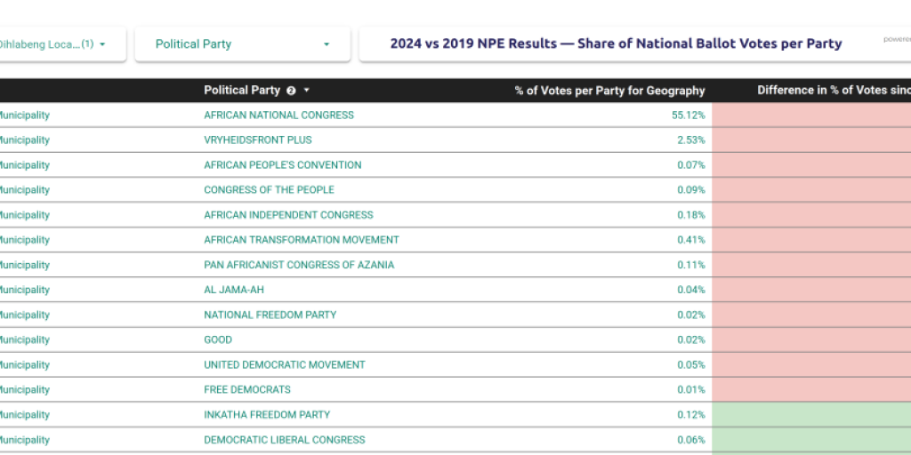
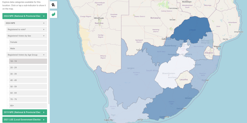
Before you can create a chart, you’ll need data. This should be in tabular form, preferably in a spreadsheet. Our data for the above chart was taken from the rich data view of the SANEF dashboard and pasted into a Google Sheet.
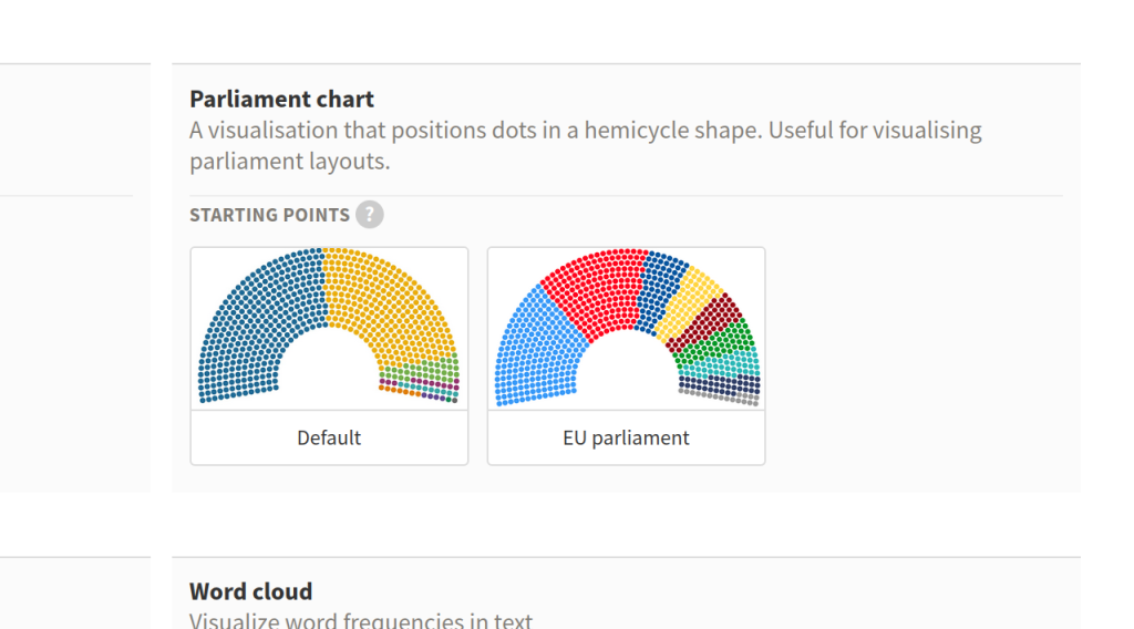
Back in Flourish, you should choose the option to make a new visualisation, and select Parliament Chart from the list that appears (you may need to scroll some way to find it).
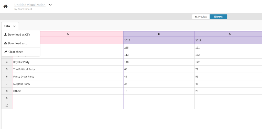
Every new visualisation in Flourish is populated with demonstration data, so the first thing to do is to go to the Data tab (above the chart), click the pull down menu next to Data and select Clear Sheet.
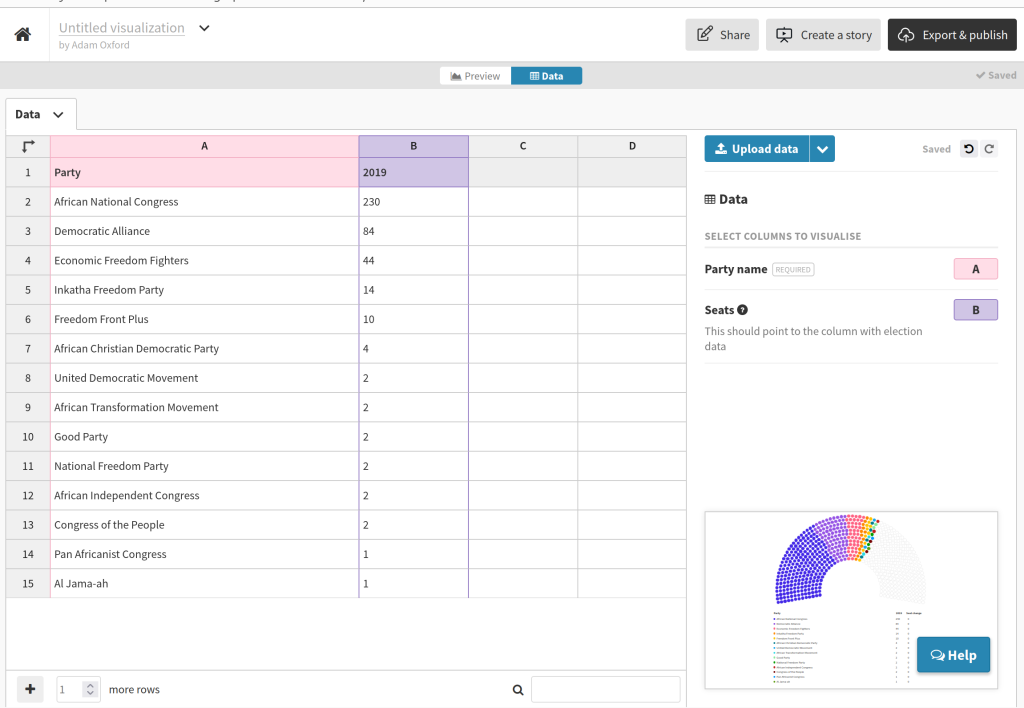
Now you can simply copy and paste data from a spreadsheet into the table, so that it looks like this.
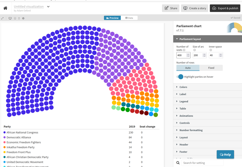
Back in the Preview tab, you can see your chart start to take shape, but right now the colours are wrong and there are too many seats in the view. Using the controls on the right hand side of the screen, change the Number of seats to 400 (the size of the SA National Assembly).
Under the control tab for Table, turn off the option for Seat change. Now go to the Colors tab to assign familiar tones to our MPs. You can do this in the Custom overrides box, where you will need to enter party names exactly as they are spelled (case sensitive) with the correct colour either as a name or a hex value. The two should be separated by a colon, for example, “African National Congress: Gold”.
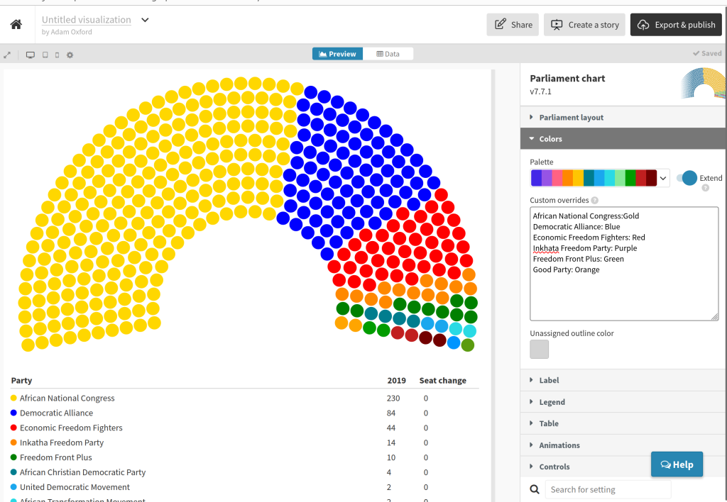
Finally, you should add headers and footers (and always include your source the footer) using the control tabs on the right, and give your visualisation a name in the top left of the screen. Once you’ve done this, you can click the Export and publish button in the top right. This will give you options to download your chart as an image, or embed an interactive version in your website.
Here’s an example of an interactive. We added the results from the 2014 election in the Data tab so you can see switch between the years and see how parliament changes between elections.
You can use the same technique for provincial and municipal assemblies. The images can be used in print or broadcast as well as online.
