Finding stories in the SANEF election dashboard
It’s impossible to tell the story of elections without touching on data. From the number of voters registered in an area, to the calculation of seats in the National Assembly, election stories are, to a greater or lesser degree, data stories. In order to help journalists access accurate, detailed and historical data relating to elections, SANEF and its partner OpenUp maintain a dashboard which makes important datasets available at the national, provincial, municipal and local level.
The dashboard is available here.
What does the dashboard contain?
The SANEF Elections Dashboard is designed to help you navigate multiple datasets in one place. The dashboard contains over 70 different datasets, sourced from organisations such as the Independent Electoral Commission (IEC), the Auditor General, SAPS, national and local government treasury departments and StatsSA. The primary way of navigating these datasets is through a map interface, where you can click into regions to refine your search.
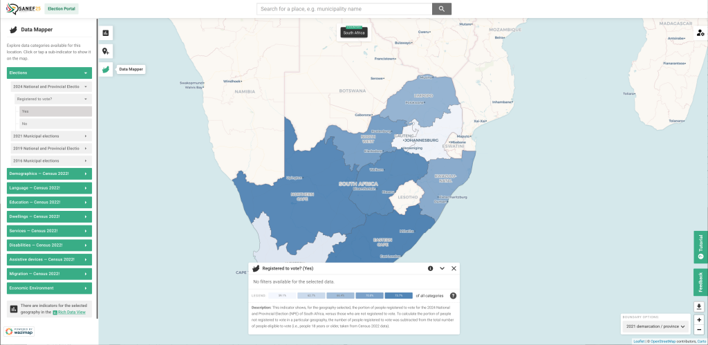
On the left hand side of the screen, you will notice three different view options, represented by the icons next to the sidebar menu. These are (from the bottom), the Data Mapper, Point Data and Rich Data views.
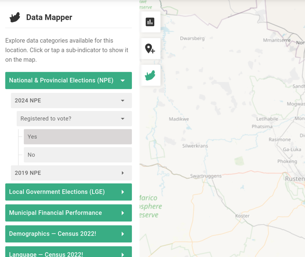
When you access the elections dashboard the default view you will see is Data Mapper. This is useful as it visualises the different metrics for a region (a province, district, municipality or ward) compared to neighbours. It’s easy to see, for example, that the Eastern Cape has the highest level of voter registration, because it is a darker blue than other areas.
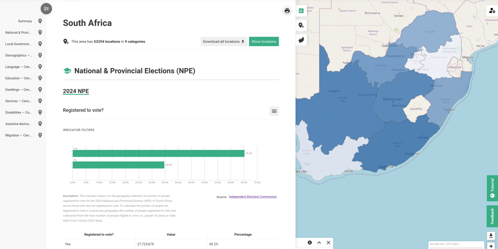
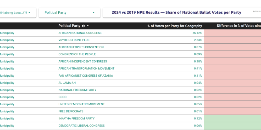
Many stories, however, will be enhanced by understanding the data profile of a particular place over time, and this is where the Rich Data view is a powerful tool. This panel contains all historical data for a particular region, displayed in table and chart form. If you want to understand how voter turnout and party preference has changed over time in a particular area, or how old the population of an area is, or how many migrants live there, this is the place to do that.
You can download data from the Rich Data view using the menus above each datapoint.
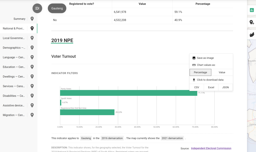
Because there is so much data available in this view, it can be quite overwhelming. It’s always best to approach the explorer with a specific question in mind, such as, “what is the ratio of female to male voters in x area?”, or “how did the proportion of votes cast for the governing party change between elections”? This approach will help you navigate the quantity of information here.
Remember, though, while data is a vital part of election storytelling, it’s not the whole story. Election coverage should be based around the “Four Ps”: People, Place, Process and Party. Data is vital to add context for each of these coverage areas, numbers can tell us a lot about all of these things. But combining data, infographics with other sources will make your stories shine.
